This post isn’t about American suit maker Adrian Jules’ glorious new Town and Country line debuting in better stores this fall as reported in Robb Report: The Global Luxury Source. If you’ve got the bones for this stuff, you don’t need advice from your old pal dapperQ.
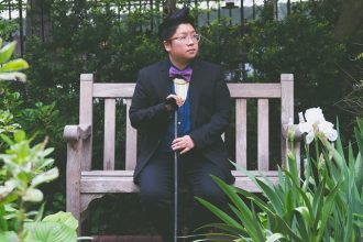
But it is about the road less taken when layering pieces this fall. You may be incorporating menswear in to your fashion but I hope you will do it in ways that most men wouldn’t even dream. Take the time to really look about this photo from Jules’ new collection and think about why these disparate elements work together.

Here are a few of the reasons for the first suit: First, brown is the color that anchors everything and provides the bolder moves a safe structure in which to preen. The white and brown of the tweed, double-breasted suit is essentially comprised of brown and white specks which are echoed and increased in the scale of the brown silk scarf with white dots.
This approach for mixing similar patterns such as two stripes or two checks, aligns with advice from menswear expert Alan Flusser, who suggests
“…keeping them as different in size or scale as possible. If the scales are too similar, it creates the optical illusion of vibration.”
The stripes of the tie and shirt coordinate but in no way match. The lilac and tan colors of the shirt both compliment the suit and provide, despite their strength, a subtle palette for the even more explosive colors of the tie.

This approach is not for the faint of heart. I love how “The Details Men’s Style Manual: The Ultimate Guide for Making Your Clothes Work for You” lists beginner, intermediate and advanced options for each style they present. These examples from Adrian Jules apply to the post-PhD range. But if you pay attention and study what gifted what stylists like these do, you can begin to think about how to begin adding a few less obvious options to your fall wardrobe.
Give it a try on the second photo, why does it work so gloriously? And send me photos of what you try?

Quentin Crisp fierce, man. DB vest FTW. I recently got a scarf from Salvation Army and am now in the process of building a collection of short scarves to wear as neckerchiefs. I’m glad to be catching up on this blog.
I love the style of the second suit. The one in brown. Ive been searching high and low for anything that resembles it, to wear at my wedding, with zero luck. Its got everything I want. The rounded Collar on the double breasted vest that almost flattens out at the bottom. The medium brown wool with light specs of tan. Even the buttons have got me mesmerized. If anyone can help me get a lead on where I can buy this I will be forever grateful. I’m only getting married once and now I don’t want to settle for any other suit. Thank you !